
You do not always need a full website redesign to get better results. Sometimes, a few small website changes can make your business look more trustworthy, easier to understand, and easier to contact.
For many small businesses, the problem is not that the website is completely broken. The problem is that visitors land on the site and have to work too hard to figure out what the business does, where it serves, why it can be trusted, or what to do next.
That is where small improvements can make a big difference. If you want to improve website conversions, start with the parts of your site that shape the first impression: your headline, call-to-action, trust signals, service descriptions, and mobile experience.
What Does “Improve Website Conversions” Mean?
A website conversion is any important action you want a visitor to take.
For a small business, that might mean:
- Calling your business
- Filling out a contact form
- Requesting a quote
- Booking an appointment
- Clicking a service page
- Signing up for an email list
- Buying a product
- Asking about website maintenance or support
Improving conversions does not mean using pushy sales tricks. It means making the website clearer, more helpful, and easier to use so visitors feel confident taking the next step.
Why Small Website Changes Matter
Small business owners are busy. Your visitors are busy too. Most people do not read every word on a website. They scan the page quickly and make a decision based on what they see first.
They are usually asking themselves:
- Is this the service I need?
- Does this business look professional?
- Can I trust them?
- Do they work with businesses like mine?
- What should I click next?
- How do I contact them?
If your website answers those questions clearly, visitors are more likely to stay. If it does not, they may leave and choose another business.
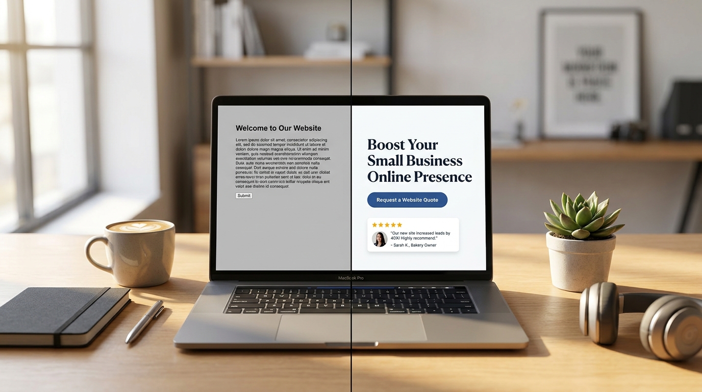
Before and After Example: A Service Business Homepage
Here is a simple example of how a few changes can improve a homepage.
Before
Headline: Welcome to Our Website
Subheading: We provide quality services for our customers.
Button: Submit
This is common, but it is too vague. The visitor does not know what the business does, who it helps, or what the next step is.
After
Headline: Clean, Modern Websites for Small Businesses
Subheading: Kreative Mojo Design helps local businesses build easy-to-use websites that look professional, work well on mobile, and make it simple for customers to reach out.
Button: Request a Website Quote
This version is stronger because it tells visitors what the business offers, who it helps, and what action to take next.
1. Make the Main Headline Clear
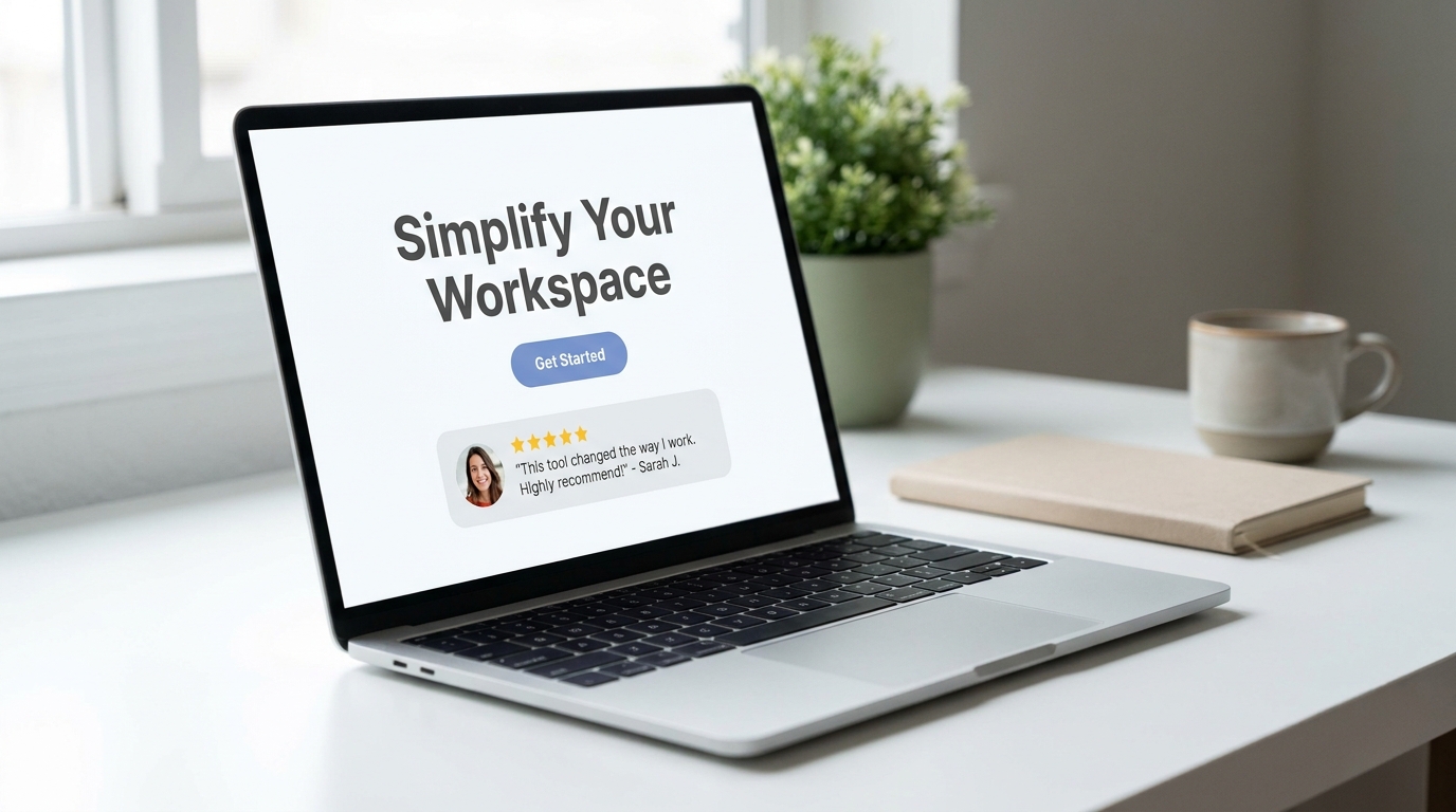
Your homepage headline is one of the most important parts of your website. It should quickly tell visitors what you do and who you help.
A vague headline might sound friendly, but it does not help people understand your business. A clear headline builds confidence faster.
Instead of: Welcome to Our Website
Try: Website Design and Maintenance for Small Businesses
Or: Clean, Mobile-Friendly Websites That Help Small Businesses Get More Leads
What to do next:
- Say what you offer in plain English.
- Mention who you help if it makes sense.
- Avoid clever wording that is hard to understand.
- Keep the headline short enough to read quickly.
- Make sure it looks good on mobile.
2. Use Better Button Text
Buttons are small, but they matter. A button tells visitors what will happen next.
Generic buttons like “Submit,” “Learn More,” or “Click Here” are not always clear. Better button text can reduce hesitation and make the next step feel easier.
Instead of: Submit
Try: Request a Website Quote
Instead of: Learn More
Try: View Website Design Services
Instead of: Contact Us
Try: Ask About Website Help
What to do next:
- Use button text that matches the action.
- Keep it short and clear.
- Place the main button near the top of the page.
- Repeat the button again after key sections.
- Make sure the button is easy to tap on mobile.
3. Add Trust Signals Near Important Decisions
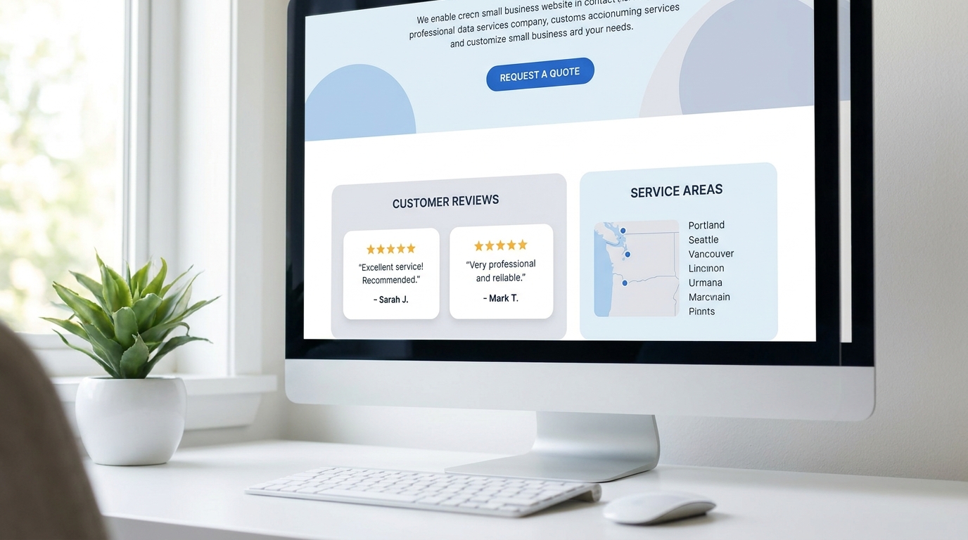
Trust signals help visitors feel more comfortable contacting you. These should not be hidden at the bottom of the website or placed only on one testimonials page.
Good trust signals include:
- Customer reviews
- Testimonials
- Project examples
- Before-and-after screenshots
- Years of experience
- Service areas
- Certifications
- Clear contact information
- Friendly process explanations
Before:
A service page lists what you offer but has no proof.
After:
The same service page includes a short testimonial, a project example, and a simple explanation of what happens after someone reaches out.
What to do next:
- Add one testimonial near your main call-to-action.
- Show real examples of your work when possible.
- Include your service area if you work locally.
- Add a short “what to expect” section.
- Make your contact information easy to find.
4. Make Service Sections Easier to Scan
Many small business websites describe services in long paragraphs. That can be hard to read, especially on a phone.
A better approach is to break services into short sections with clear headings, simple descriptions, and helpful bullets.
Before:
One long paragraph explaining everything the business does.
After:
A clean service section with headings like:
- Website Design
- Website Maintenance
- Graphic Design
- SEO and Local Search
- Website Updates
Each section should briefly explain what the service does and who it helps.
What to do next:
- Use short service descriptions.
- Add one clear benefit for each service.
- Link to dedicated service pages.
- Avoid stuffing every detail onto one page.
- Make sure the layout is easy to skim.
5. Put Contact Options Where People Expect Them
If visitors have to search for your contact information, you may lose leads.
Small businesses should make it easy for people to reach out. That does not mean every page needs to feel aggressive. It means the next step should always be clear.
Helpful contact options include:
- A contact button in the header
- A short form on the contact page
- Phone number or email if you want people to use them
- A call-to-action near the bottom of service pages
- A simple message about what happens after someone contacts you
Before:
The only contact link is hidden in the footer.
After:
The header has a clear “Request a Quote” button, service pages end with a helpful call-to-action, and the contact form asks simple questions.
What to do next:
- Add a clear contact button in the main navigation.
- Keep forms short.
- Ask only for information you actually need.
- Explain when people can expect a response.
- Test the form on mobile.
6. Improve the Mobile Experience
A website may look good on a desktop but feel frustrating on a phone. Since many visitors browse from mobile devices, this can affect conversions.
Mobile issues often include:
- text that is too small
- buttons that are hard to tap
- forms that feel too long
- menus that are confusing
- images that load slowly
- important information pushed too far down the page
Before:
A visitor has to pinch and zoom to read the page or tap a tiny button.
After:
The page has short sections, readable text, clear buttons, and easy contact options.
What to do next:
- Open your website on your phone.
- Check your homepage, service pages, and contact form.
- Make sure buttons are easy to tap.
- Keep paragraphs short.
- Remove unnecessary clutter from mobile layouts.
7. Make the Website Feel Current
A website does not have to be trendy to be effective, but it should feel current and cared for. An outdated website can make visitors wonder if the business is still active.
Small updates can help your site feel more professional.
These may include:
- Replacing old images
- Updating service descriptions
- Fixing broken links
- Improving spacing
- Refreshing outdated graphics
- Updating copyright dates
- Checking forms and buttons
- Adding recent reviews or project examples
Before:
The site has old photos, outdated wording, and a layout that feels neglected.
After:
The site feels clean, current, and easier to trust, even without a full redesign.
What to do next:
- Review your site every few months.
- Update old service information.
- Replace low-quality images.
- Add recent testimonials.
- Keep WordPress, themes, and plugins updated.
How Kreative Mojo Design Helps Clients Achieve This
Many small business owners know their website could be better, but they are not sure where to start. That is where Kreative Mojo Design can help.
Instead of overwhelming clients with technical language, we focus on practical website improvements that make the site clearer, easier to use, and more helpful for customers.
Depending on the business, that may include:
- Reviewing the homepage for clarity
- Improving headlines and calls-to-action
- Making service pages easier to understand
- Adding trust signals and testimonials
- Improving mobile layout issues
- Cleaning up cluttered sections
- Updating outdated content
- Improving website speed and performance
- Helping with redesigns when small fixes are not enough
- Providing ongoing website maintenance and support
The goal is simple: help the website do a better job of supporting the business.
A website should not just sit there. It should help visitors understand what you offer, trust your business, and take the next step with confidence.
Quick Website Conversion Checklist
Use this checklist to spot simple improvements:
- Does the homepage explain what the business does within five seconds?
- Is the main call-to-action clear?
- Are the buttons specific?
- Are service descriptions easy to skim?
- Are testimonials or reviews visible near key sections?
- Is the contact page simple?
- Does the site work well on mobile?
- Are images compressed and loading quickly?
- Does the site feel current and active?
- Is there a clear next step on every important page?
If several answers are “no,” the website may be missing easy opportunities to convert more visitors into leads.
Common Mistake to Avoid
One common mistake is thinking a better website always means a bigger website.
More pages, more sections, more text, and more features do not automatically create better results. Sometimes they create confusion.
A stronger website usually starts with clarity. Make the message easier to understand. Make the next step easier to take. Make the business easier to trust. Those simple improvements can often do more than adding another complicated feature.
FAQs About Improving Website Conversions
What is a website conversion?
A website conversion is when a visitor takes an action you want them to take. That could mean calling, filling out a form, requesting a quote, booking an appointment, or clicking to learn more about a service.
Do I need a full redesign to improve website conversions?
Not always. Many websites can improve with smaller updates like clearer headlines, better buttons, stronger trust signals, improved mobile layouts, and simpler contact forms. A full redesign may be helpful if the site is outdated, confusing, slow, or difficult to manage.
What is the easiest website change to start with?
Start with your homepage headline and main call-to-action. Visitors should quickly understand what you do and what step to take next. If those two things are unclear, the rest of the website has to work harder.
How can small businesses build more trust on their website?
Small businesses can build trust by showing reviews, testimonials, real project examples, service areas, clear contact information, and a simple explanation of the process. Trust signals work best when they are placed near important decision points.
Can website maintenance help conversions?
Yes. Website maintenance helps keep your site updated, secure, functional, and running smoothly. A broken form, outdated plugin, slow page, or old service description can hurt trust and reduce conversions.
Final Thoughts
Small website changes can make a big difference when they help visitors understand, trust, and contact your business more easily.
You do not always need to start with a full redesign. Sometimes the best first step is improving the parts of your website that matter most: the headline, call-to-action, service sections, trust signals, mobile experience, and contact path.
If your website looks fine but does not bring in enough leads, it may be time to look closer at how visitors experience each page.
Kreative Mojo Design helps small businesses improve their websites with clear design, practical updates, and ongoing support that makes the site easier to use and easier to trust.
Explore our website design services or learn about our website maintenance to see how your website can better support your business.