
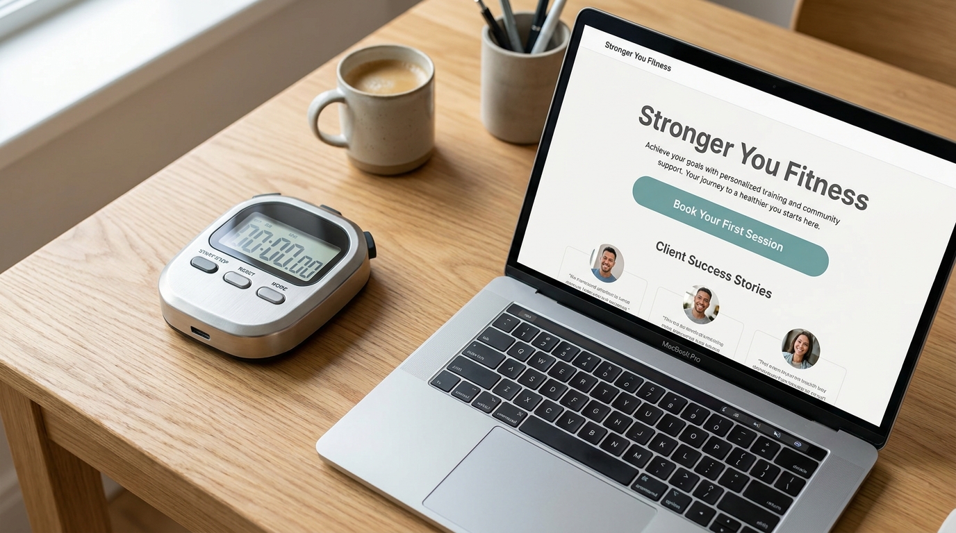
If someone lands on your homepage, they decide very quickly whether to stay or leave.
For many small businesses, the problem is not the service — it is the homepage clarity.
That is where the 5-second homepage test helps.
What is the 5-second homepage test?
It is a simple test:
- Show your homepage to someone who is unfamiliar with your business.
- Let them look for five seconds, then hide the page.
- Ask what the business offers, who it helps, and what they would do next.
If the answer is unclear, your homepage needs a clearer message.
Why this matters
If visitors cannot quickly understand your business, they may:
- Click back to Google
- Choose a competitor
- Browse but never contact you
Clarity builds trust. Trust creates leads.
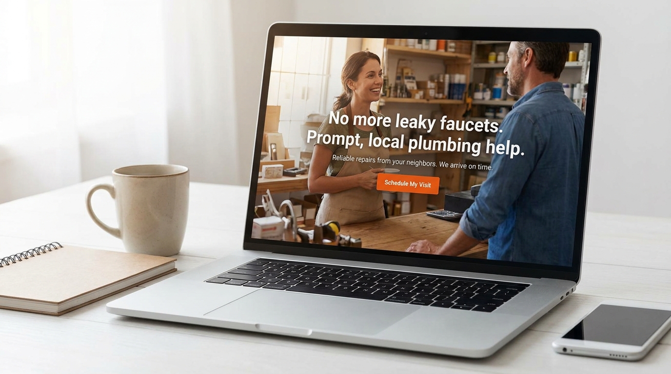
Quick wins to pass the 5-second test
Start with the parts of the page that explain your offer and the next step.
1. Rewrite your main headline (above the fold)
Your headline should say what you do in plain English.
Instead of: “Welcome to our website”
Try: “Modern Websites for Small Businesses (Design + Maintenance)”
Or: “Pressure Washing in Orange County — Fast Quotes + Reliable Service”
Tip: If you are local, include your service area.
2. Add a helpful subheadline
Your subheadline should reduce confusion and add a benefit.
Example:
“Kreative Mojo Design builds clean, mobile-friendly websites that make it easy for customers to understand your services and reach out.”
3. Use one main button with clear text
Buttons should tell people what happens next.
Instead of: Submit / Learn More
Try: Request a Quote / Schedule a Call / Get Website Help
4. Make your top section feel trustworthy
In the first screen of your homepage, include one trust element, such as:
- A short testimonial
- Star rating
- “Serving Orange County since…”
- A small “featured work” preview
5. Remove clutter from the top section
If your top section has:
- 5 different buttons
- Lots of tiny text
- A slideshow
…it can feel overwhelming.
Quick win: One headline, one subheadline, one button, one trust element.
A simple before/after example
Before
Headline: Quality Services You Can Trust
Button: Learn More
This is polite, but it is vague.
After
Headline: Website Design for Small Businesses
Subheadline: Clean, mobile-friendly sites that help customers understand your services and contact you.
Button: Request a Website Quote
This version is clear and action-focused.

Common mistake to avoid
A common mistake is writing for yourself instead of the visitor.
Visitors do not know your business like you do. They need simple words and obvious next steps.
What to do next
Try this today:
- Ask someone unfamiliar with your business to try the test.
- Write down what they understood and what was unclear.
- Rewrite the headline and button to match what you actually want people to do.
If you want a quick, honest review, Kreative Mojo Design can give you 3 homepage clarity fixes that can help your site convert better.
Key takeaways
- People decide fast whether to stay on your site.
- Your homepage should explain what you do in 5 seconds.
- One clear headline + one clear button beats fancy design.
- Add one trust signal near the top.
- Remove clutter so the message is easy to scan.
FAQs
What should a homepage headline say?
It should say what you do in plain English, who you help, and where you serve (if relevant).
How do I know if my homepage is confusing?
If people ask basic questions you already answered, or you get traffic but few inquiries, clarity may be the issue.